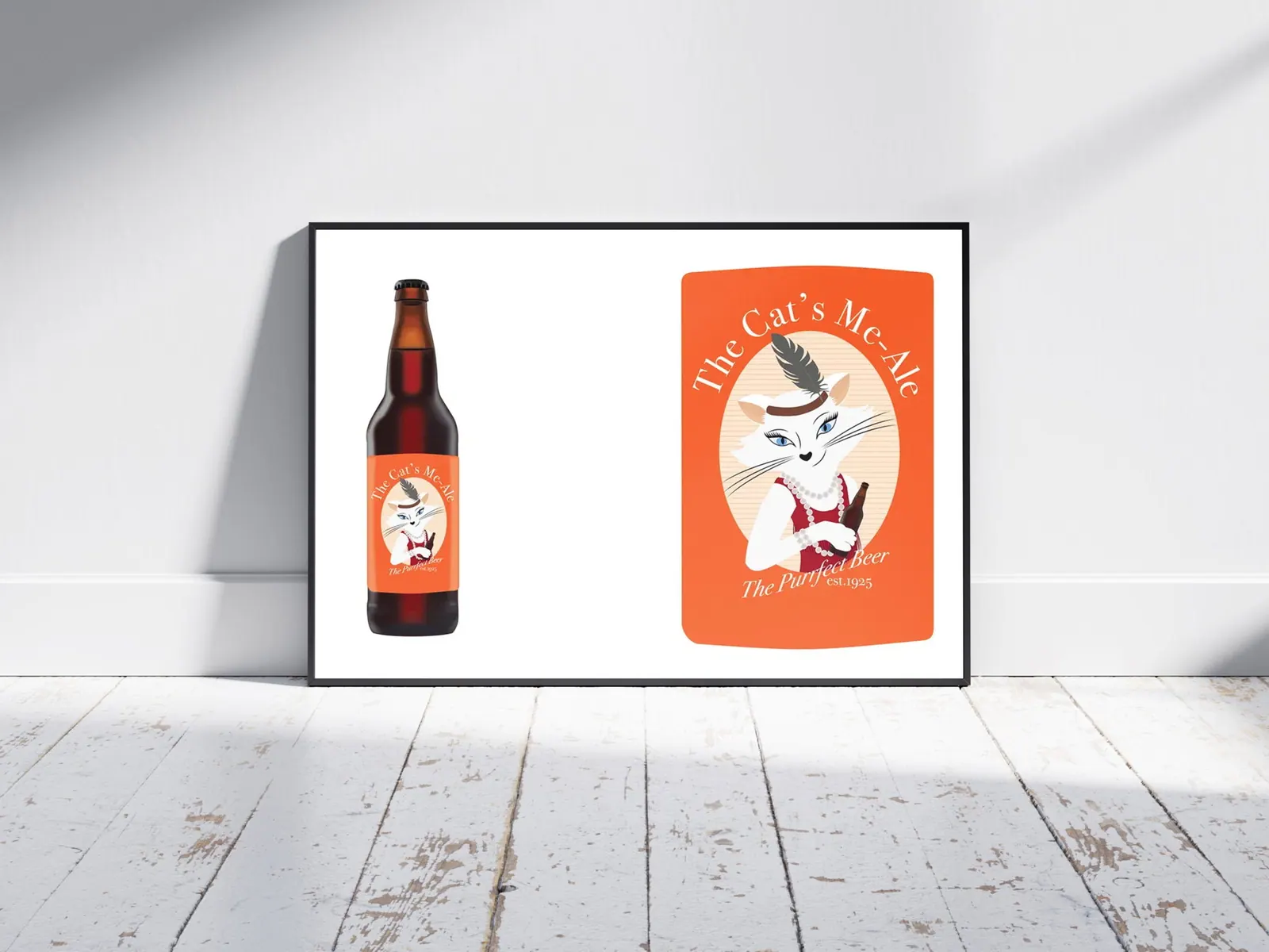
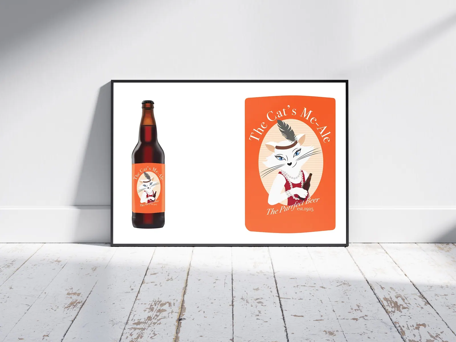
This project involved designing a custom glass bottle and creating an original label in Adobe Illustrator. For my concept, I designed a beer brand called The Cat's Me-Ale — a playful nod to 1920s slang for something “excellent” or “the best.”
The label design was inspired by the Roaring Twenties, featuring an illustrated cat styled as a glamorous flapper girl. I combined vintage typography, warm tones, and art-deco-inspired shapes to capture the era's charm while keeping the overall look fun and approachable. The result is a lively, character-driven design that blends nostalgia with whimsy — perfectly fitting for a brand with personality and style.
01 — Project Context & Goals
A craft beer with a Roaring Twenties personality
The assignment was to design both a custom glass bottle form and an original label for a beverage brand. I wanted the brand to feel like a character, not just a logo — something a customer would remember and want to pick up from a crowded craft beer shelf.
02 — Design Strategy & Visual Hierarchy
Art Deco geometry and narrative illustration
The look draws on 1920s Art Deco: symmetrical framing, stepped geometric borders, sunburst motifs, and vintage display lettering. Within that frame, a narrative illustration style tells a small story — the feline mascot dressed as a glamorous flapper, as if caught mid-party in a jazz-age speakeasy.
Character development focused on giving the cat a confident, playful pose and period-appropriate details such as the bob silhouette, beads, and headband, so the illustration carries the brand's personality on its own. Hierarchy on the label moves from the mascot to the brand name to the beer style.
03 — Deliverables & Channels
Packaging components
The concept was developed as a complete packaging presentation.
- 01Custom bottle form — a shape designed to complement the Art Deco styling of the label.
- 02Label artwork — the illustrated flapper cat, brand lockup, and supporting typography.
- 03Label die-lines — label shapes and dimensions mapped to the bottle so artwork wraps correctly.
- 04Bottle mockups — photorealistic renders showing the finished label in context.
04 — Production Execution
Illustrated in vector, proven in mockup
The illustration and lettering were created as vector artwork in Illustrator, built to the label die-line with bleed and safe areas so nothing important would be lost on the curve of the bottle. The final artwork was placed onto bottle mockups in Photoshop to check legibility, colour, and how the character reads from a distance.
Brand & Packaging Design · Concept Project
Illustrator · Photoshop
© 2023