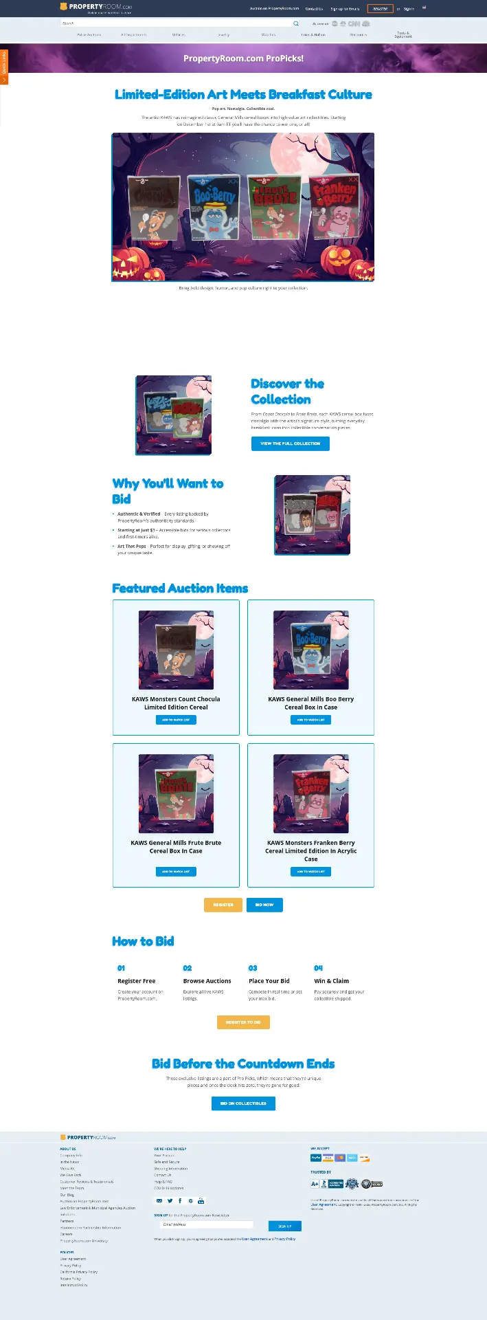
PropertyRoom brought back its Brilliance Collection — a curated series of certified luxury timepieces — with an 18kt yellow gold Rolex Yacht-Master II as the headline lot. Evaluated by an in-house AGS/GIA certified gemologist and opening at $1 with no reserve, the piece needed a campaign that felt as considered as the watch itself while still reading clearly to a bidding audience scanning a busy marketplace.
01 — Approach
Deep navy, brushed gold, and one hero object.
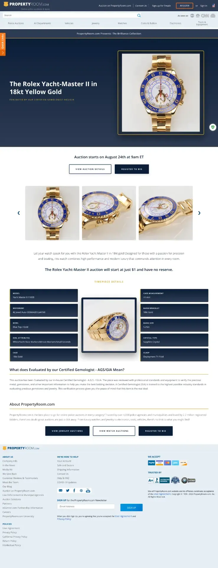
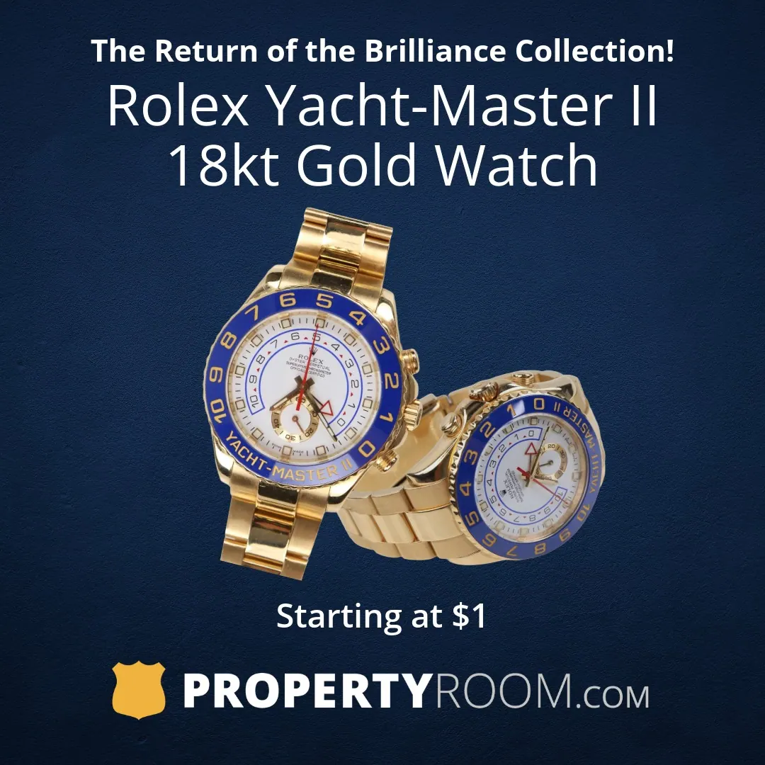
I built the system around a deep navy field that lets the gold case and cobalt bezel carry all of the visual weight. Type stays quiet and generous — a single headline, a short qualifier, one button — so the watch is always the first and last thing you look at. A marble treatment on the live-phase assets signals the shift from anticipation to action without changing the brand voice.
The landing page opens with a full-bleed hero, then steps bidders through a gallery carousel, a spec grid of the timepiece details, and a plain-language explainer of what a certified gemologist evaluation actually means — the detail most likely to convert a hesitant bidder — before closing on register-to-bid calls to action.
 Hover to scroll
02 — Campaign phases
Preview builds the anticipation. Live drives the bid.
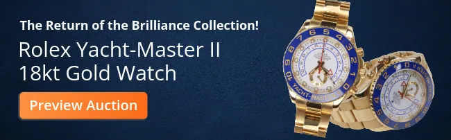
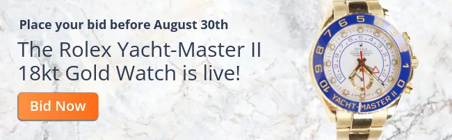
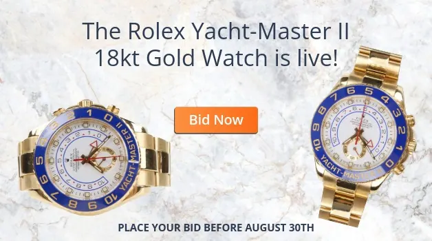
Each surface was designed in two states. Preview assets announce the return of the Brilliance Collection and push to an auction preview; live assets swap to a marble ground, an urgent 'is live!' headline, and a hard deadline before August 30th.

Takeaway
A luxury lot on a police-auction marketplace has to do two jobs at once: feel premium enough to earn trust, and stay legible enough to convert. Restraint — one object, one message per surface — did both.
Web & Campaign Design · PropertyRoom.com
Figma · Photoshop · Illustrator · After Effects
© 2026