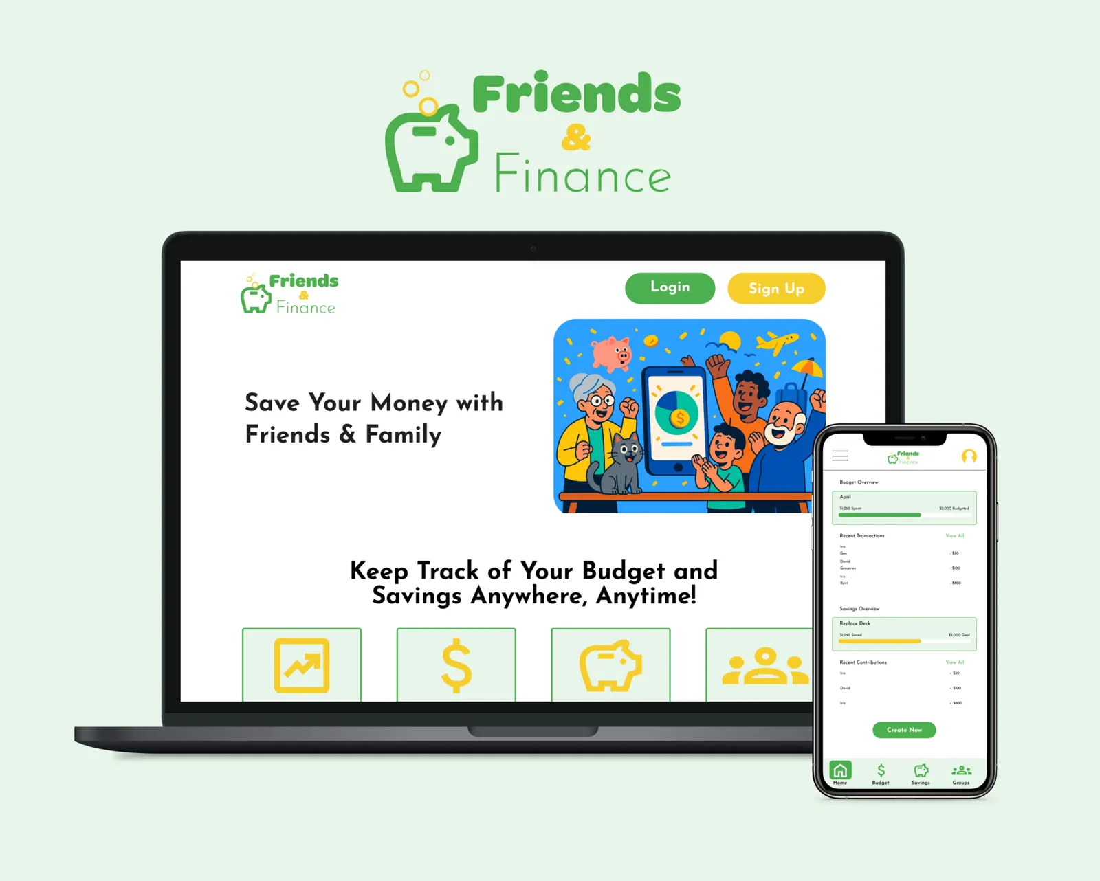
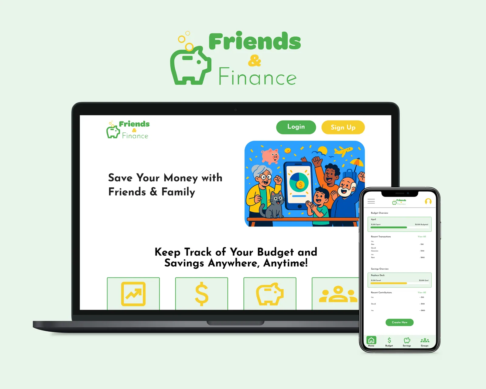
Friends & Finance is a mobile-first app (with a responsive web companion) that helps families and friend groups track shared budgets and savings goals — transparently, in real time, without the awkward 'who paid for what' conversations.
01 — Problem
Shared money creates social friction
Families and friend groups don't have a single, transparent place to track shared spending and contributions. Costs get buried in group chats and spreadsheets, progress toward shared goals (like a vacation or a wedding gift) is invisible, and reminders feel awkward — leading to confusion, resentment, and stalled goals.
Design challenge
How might we let small groups log shared expenses in seconds and see real-time progress toward a shared goal — so contributing feels easy, fair, and motivating?
02 — Research
Listening to how groups actually handle money
I ran 8 user interviews and a 32-response survey with people who currently share expenses with family, roommates, or friends. I wanted to understand the workflows they cobble together today, where trust breaks down, and what a 'good' shared-money tool would have to do on day one.
Four pain points kept surfacing
- 01Information overload — existing finance apps drown casual users in charts, categories, and features they don't need.
- 02Steep learning curve — setting up a budget feels like accounting homework, so people abandon before they start.
- 03Invisible progress — without a visual sense of 'how close are we?', motivation to contribute dies quickly.
- 04Tedious tracking — manually entering and categorizing every transaction is the single biggest reason people quit.
“I just want to open it, see how much we've saved for the trip, and close it. That's it.”
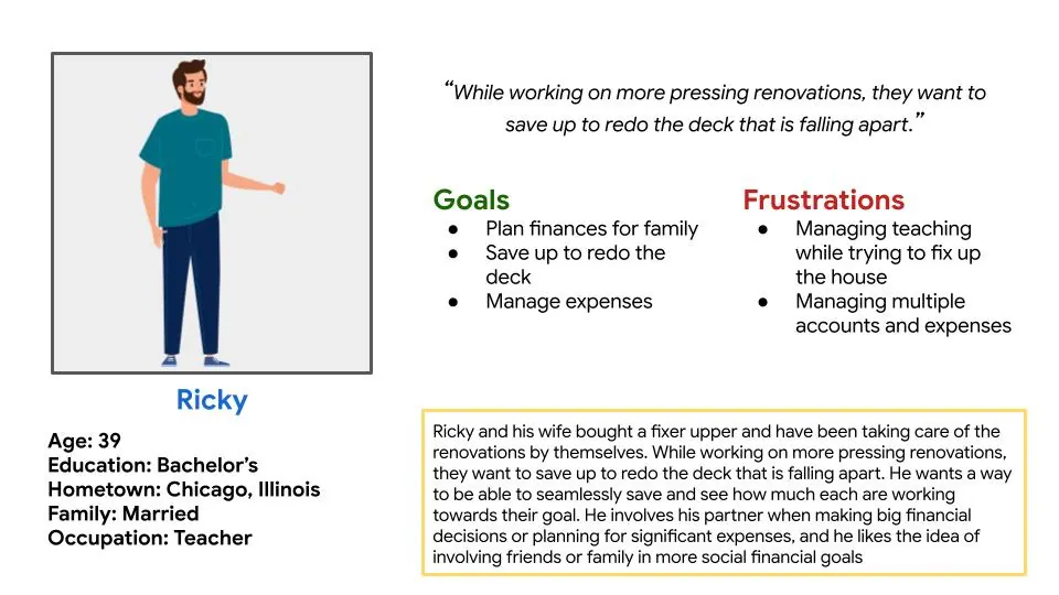
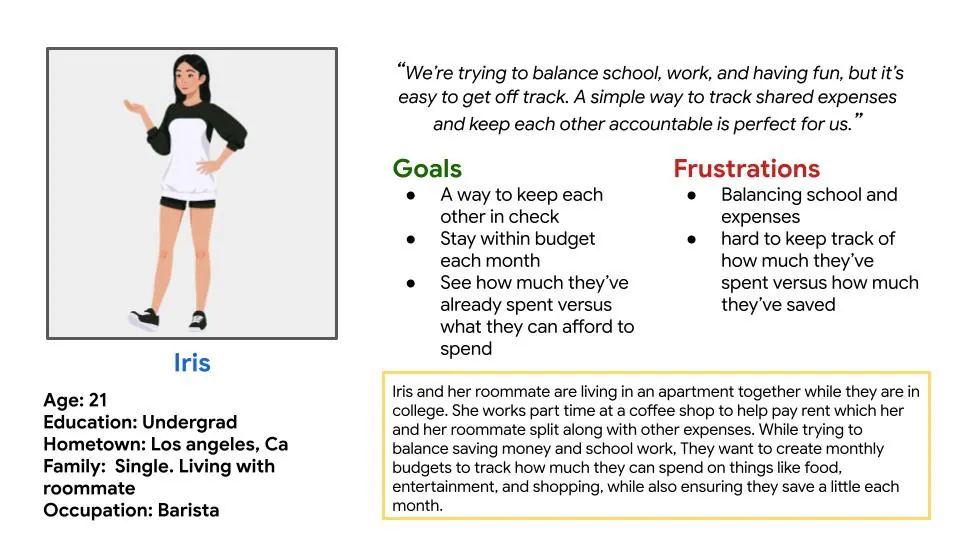
I synthesized the research into two primary personas representing the two dominant mental models I heard: the 'organizer' who sets up the goal, and the 'casual contributor' who just wants to drop in money and see progress.
03 — Explorations
Sketching, wireframing, testing fast
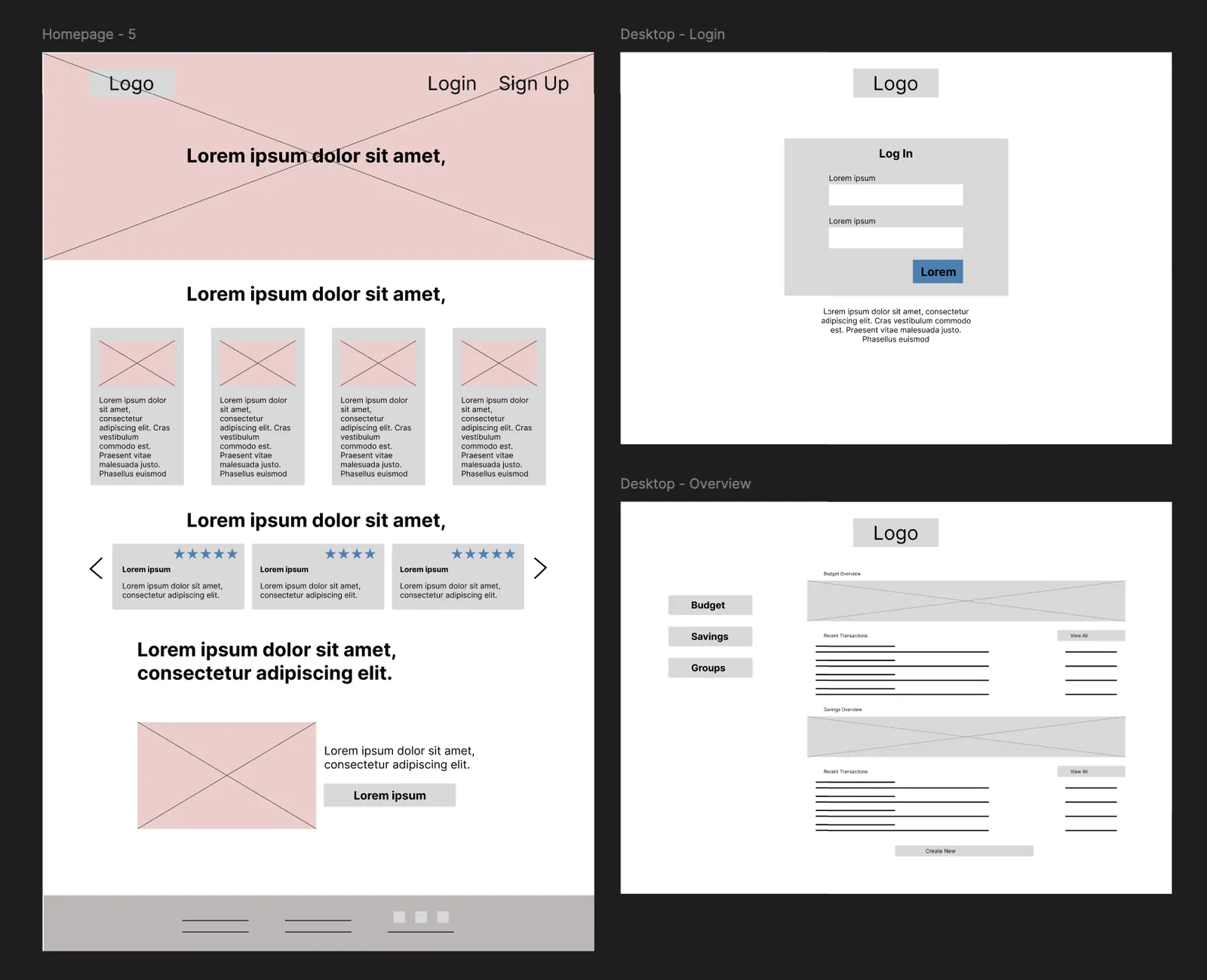
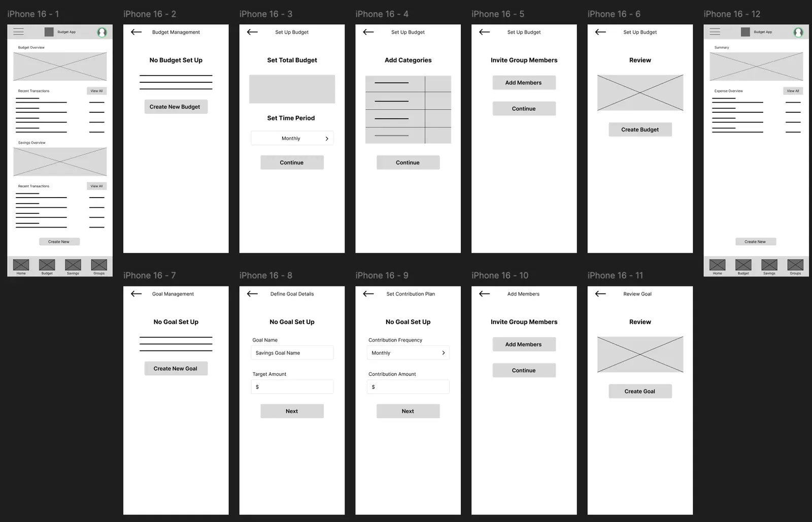
I started with low-fidelity wireframes focused on one question: what does a user need to see in the first 3 seconds after opening the app? I tested three layout directions — a feed of recent transactions, a goal-first dashboard, and a hybrid card view — with 5 users on Maze.
The goal-first dashboard won decisively — users wanted progress as the hero, not a transaction log. From there I moved to mid-fidelity, designing parallel mobile and responsive web flows so the same group could coordinate across devices. I used AI-assisted layout exploration to test density variations quickly.
04 — Decisions
Three calls that shaped the final design
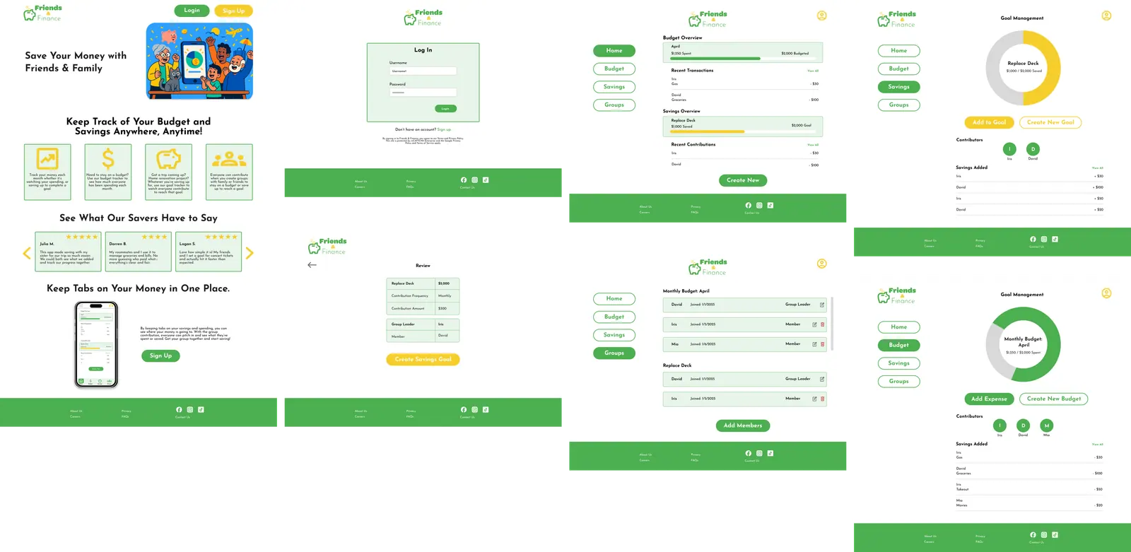
- 01Color as category — green for budgets, gold for savings goals. A single glance tells you what kind of pot you're looking at, without reading a label.
- 02Progress before numbers — every screen leads with a visual progress indicator. The dollar amount is supporting information, not the headline.
- 03One-tap logging — adding an expense is a single screen with smart defaults pulled from the active goal, cutting the most-cited drop-off point in research.
Accessibility was non-negotiable through the high-fidelity stage — sufficient color contrast, predictable layout, and a clear text hierarchy so the app works for users with low vision and for someone checking their balance one-handed on a crowded subway.
05 — Outcomes
What the prototype proved
- Task success
- 92%
- Avg. time to log expense
- 11s
- SUS score
- 84 / 100
- Would use again
- 9 / 10 testers
Usability testing on the high-fidelity prototype showed users could complete the core tasks — creating a shared goal, inviting a member, logging a contribution, and checking progress — without guidance. The 'progress before numbers' decision tested especially well: every participant correctly identified the status of a goal within 2 seconds of opening the screen.
06 — Reflection
What I'd do next
If I were taking this into a v2, the next bets would be lightweight bank-connection for auto-categorization (the #1 unprompted request in testing), nudges that feel encouraging rather than guilt-trippy, and a 'settle up' flow for friend groups who split rather than pool. The bigger lesson for me: in a category built on dense dashboards, restraint is a feature.
UX Research, UX/UI Design · Capstone Project
Figma · Maze · Miro
© 2024