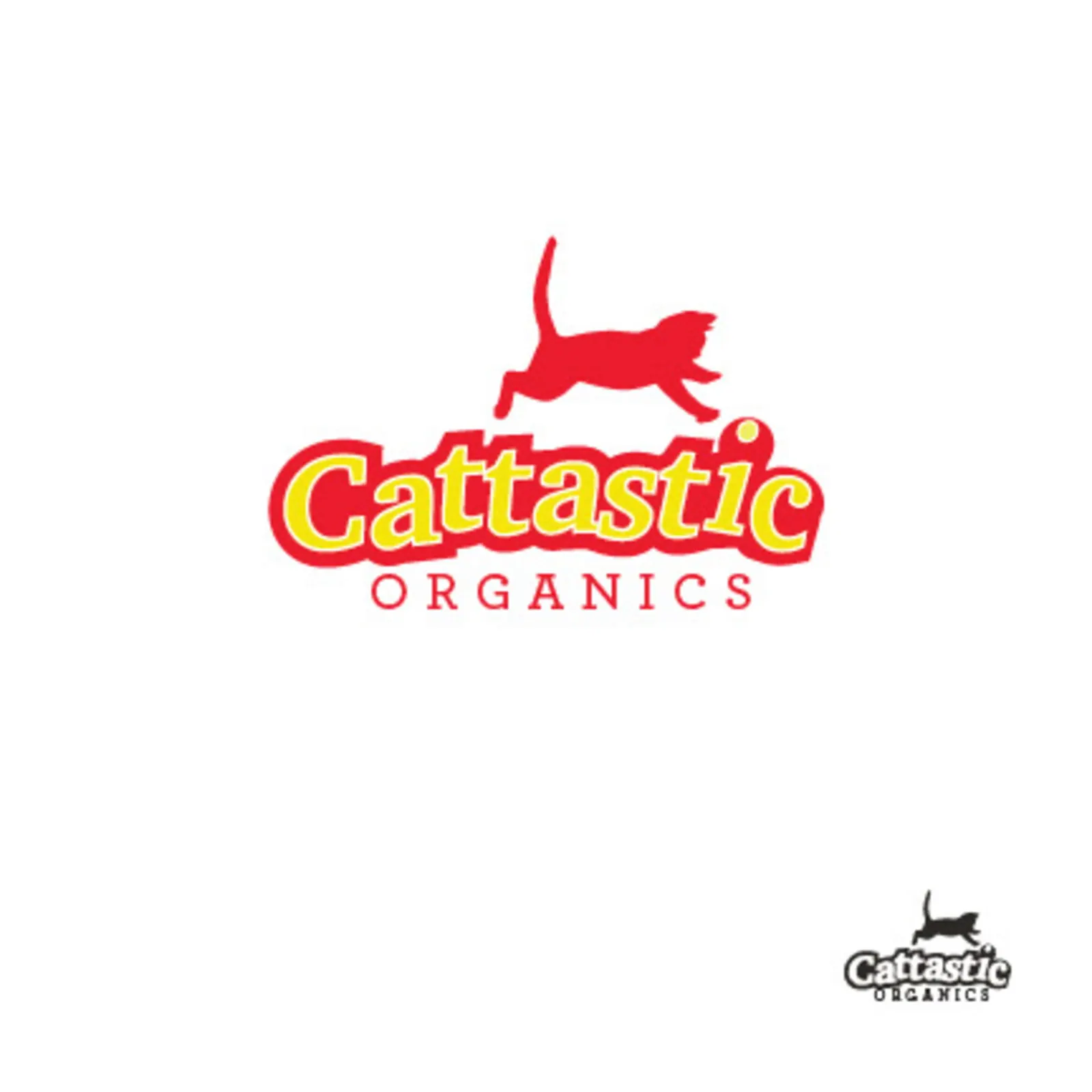
This college project challenged me to create a full brand identity — including a logo and packaging — for a fictional company. I developed Cattastic Organics, an organic cat treat brand that focuses on using all-natural ingredients to give cats a healthy, wholesome snack.
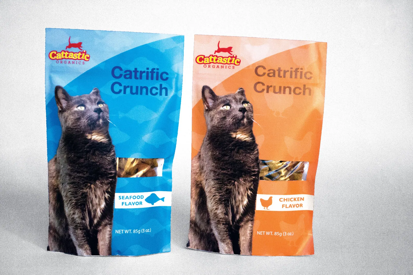
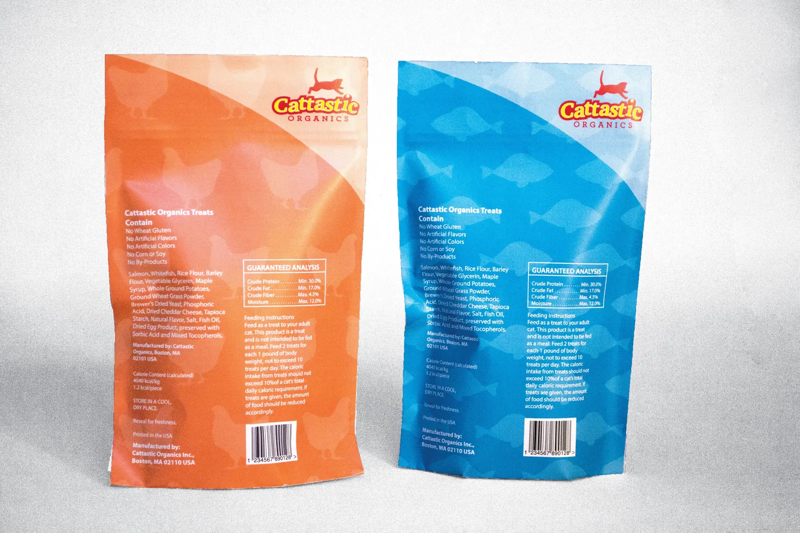
The design embraces the playful and energetic nature of cats, reflected in both the logo and packaging. The leaping cat graphic captures movement and joy, while the bold typography and bright color palette convey a sense of fun and friendliness. Each treat bag design highlights its specific flavor through unique color and pattern choices, reinforcing the brand's natural and approachable personality.
01 — Project Context & Goals
A brand built around healthy, happy cats
The brief was to create a complete brand from scratch: a name, a logo, and a packaging system that could sit on a pet-store shelf and communicate natural, wholesome ingredients at a glance. Because the company is fictional, every decision — from voice to colour to pack structure — had to be invented and justified as part of the identity.
02 — Design Strategy & Visual Hierarchy
Custom type and an earthy, playful palette
The logotype pairs rounded, friendly letterforms with the leaping cat mark so the name feels energetic without losing legibility. I chose an earthy, playful palette — natural greens and warm tones balanced with brighter flavour accents — to signal organic ingredients while keeping the range fun and approachable for cat owners.
On each pouch, the hierarchy runs from brand to flavour to benefit: the logo anchors the top, a bold flavour name and colour band identify the variety, and organic-style ingredient callouts reinforce the natural positioning.
03 — Deliverables & Channels
Packaging architecture
The identity was delivered as a coordinated system rather than a single pack.
- 01Logo and brand mark — primary lockup with the leaping cat illustration.
- 02Pouch range — a family of treat bags with a unique colour and pattern per flavour for quick shelf recognition.
- 03Front panel — brand, flavour name, hero illustration, and organic-ingredient callouts.
- 04Back panel — product description, ingredient list, feeding guidance, and supporting brand details.
04 — Production Execution
From vector art to shelf-ready mockups
All artwork was built as vector files in Illustrator so the logo and illustrations scale cleanly across pack sizes. Front and back panels were laid out to the pouch dimensions with consistent margins and type styles, then placed into realistic mockups in Photoshop to evaluate how the range reads as a set.
Brand Identity & Packaging · College Project (fictional brand)
Illustrator · Photoshop
© 2023