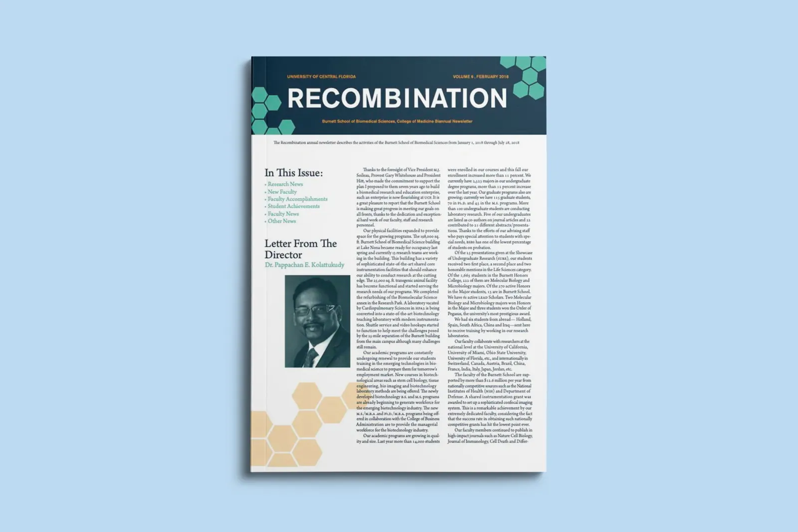
Recombination is a simulated scientific newsletter designed for the University of Central Florida's Burnett School of Biomedical Sciences. The project was structured to mirror a real client engagement — including the messy parts — and culminated in a fully designed publication with a custom masthead and editorial system.
01 — Problem
Academic content that feels alive, not stiff
Scientific publications tend to lean either too clinical (walls of body copy, no hierarchy) or too consumer (overdesigned, undermining authority). The challenge was to build a newsletter that read as credibly academic while still inviting a non-expert reader in — and to do it under realistic client conditions where assets and direction were a moving target.
Design challenge
How might we design a recurring scientific newsletter system — masthead, grid, type hierarchy — that holds up across issues while accommodating last-minute content changes from a real client?
02 — Research
Studying the editorial landscape
I gathered references from established science publications (Nature, Scientific American, university research magazines) to map the conventions readers already expect — column structure, citation styling, pull quotes, figure treatment — and to identify where the publication could carve out its own voice without breaking the genre.
- 01Confident, serif-led masthead — the genre signals credibility through typography first.
- 02Multi-column grids that flex between feature articles and shorter research briefs.
- 03Generous figure captions — readers of academic content rely on captions as much as body copy.
03 — Explorations
Masthead and grid systems in parallel
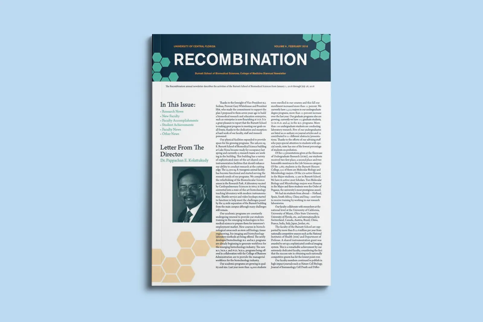
I sketched several masthead directions — from ultra-modern sans serifs to traditional serif lockups — and tested each against draft article layouts to see which one held the page together. In parallel, I prototyped a 3-column grid that could collapse to 2 for feature spreads, ensuring the same system could carry different content types issue to issue.
04 — Decisions
Three calls that defined the system
- 01Serif masthead with a scientific accent mark — credibility first, with a small visual signature that ties back to the 'recombination' theme.
- 02Flexible 3/2-column grid — so research briefs and long-form features both feel native to the same publication.
- 03Strict typographic hierarchy — three type sizes, one accent color, and consistent caption styling so future issues stay on-brand even if the editor changes.
“Assets arrived out of order, files were mislabeled, and new sections appeared the week of delivery — exactly like a real client.”
05 — Outcomes
A publication system, not just an issue
The final newsletter captured the professional tone of a scientific publication while staying readable and visually paced. More importantly, the layout system was built to be reusable — a future editor could drop new content into the established grid and type hierarchy without redesigning the publication.
06 — Reflection
What the simulation taught me
Working under simulated client constraints — vague briefs, mislabeled files, late additions — taught me to design systems rather than one-off layouts. The version-control discipline and the willingness to build flexibility into the grid up front were the difference between a project that held together and one that would have unraveled at the last revision.
Editorial / Publication Design · Burnett School of Biomedical Sciences (Simulation)
InDesign · Illustrator
© 2023
