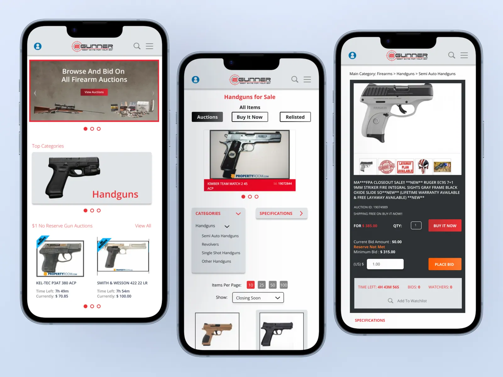
eGunner.com is an online auction marketplace for firearms, ammunition, and related accessories — featuring listings from licensed FFL dealers alongside auctions through partners like PropertyRoom.com. I lead ongoing UX/UI work on the site, with a focus on making the buying experience faster and clearer across mobile and desktop.
01 — Problem
Users couldn't find what mattered, fast
The most time-sensitive information in an auction — current price, time left, and number of bidders — was buried below the fold on listing pages. Category browsing lacked filters, the menu forced users back to the homepage to switch categories, and the entire mobile experience felt cramped and hard to navigate.
Design challenge
How might we restructure eGunner's core pages so a bidder can land, orient, and place a confident bid in under 30 seconds — on any device?
02 — Audit
What was getting in the way
I audited the existing site page-by-page on both mobile and desktop, mapping the click paths users had to take to complete the three highest-value tasks: find a category, scan an active auction, and place a bid. Three recurring failure points emerged.
- 01Critical auction data (price, time left, bidder count) sat below the fold on the listing page — requiring a scroll on every visit.
- 02Category pages had no filters, so a user looking for a specific caliber or manufacturer had to scan dozens of unrelated cards.
- 03The mobile menu only exposed top-level categories and dumped users back to the homepage when switching — breaking the browse flow entirely.
03 — Explorations
Restructuring around the bid moment
I redesigned the homepage, category, and listing pages in parallel so layout decisions on one would reinforce the others. The guiding rule: anything a user needs to decide whether to bid lives above the fold, and anything they need to keep browsing is one tap away.
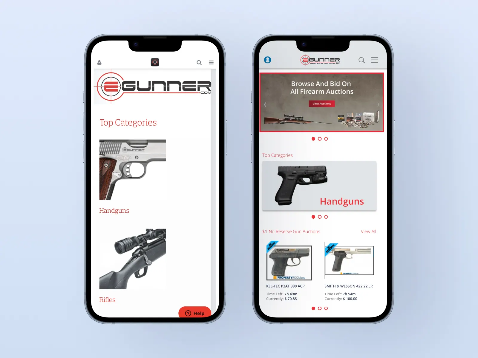 Hover to scroll
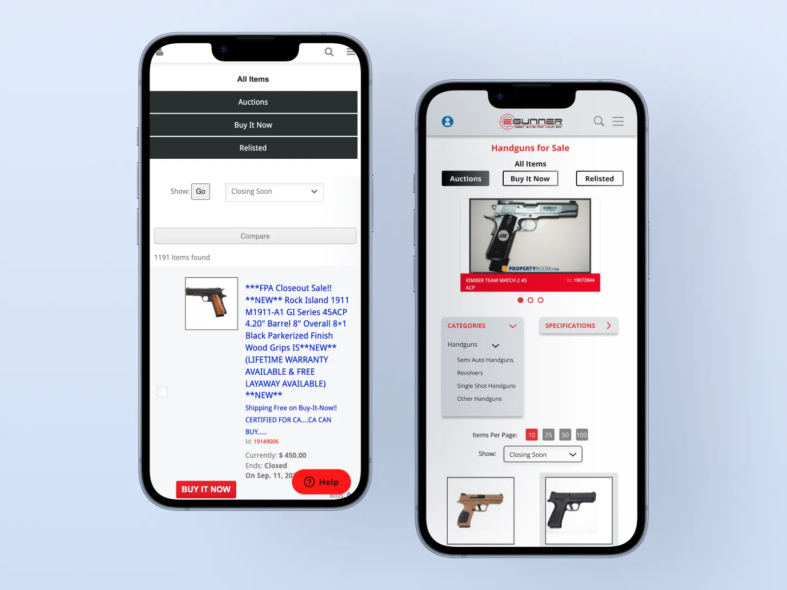 Hover to scroll
04 — Decisions
Three calls that shaped the redesign
- 01Bid info first — reordered the listing page so current price, time left, and bidder count sit at the top of the viewport on both mobile and desktop.
- 02Filterable category pages — added a filter rail and switched to a denser card grid so users can narrow by caliber, manufacturer, and price without scrolling endlessly.
- 03Persistent mega-menu — rebuilt the main navigation to expose main categories and subcategories from every page, eliminating the forced trip back to the homepage.
 Hover to scroll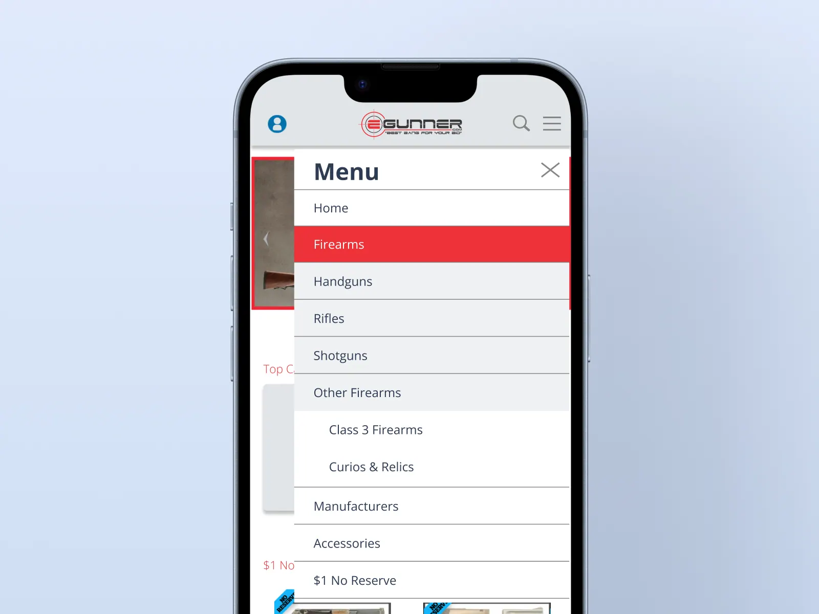

05 — Outcomes
A faster, calmer browse
The restructured pages put the most-needed information in front of bidders immediately and made cross-category browsing possible without backtracking. The denser, filterable category view also surfaces more inventory per scroll — a direct win for an auction marketplace where every additional listing seen is a potential bid.
06 — Reflection
What I'd tackle next
The next iterations I'd push for are saved searches and watchlist surfacing on the homepage, a sticky bid bar on mobile listing pages, and a unified design system shared between eGunner and PropertyRoom to speed up cross-property work.
UX/UI & Web Design · eGunner / PropertyRoom.com
Figma · Photoshop
© 2024