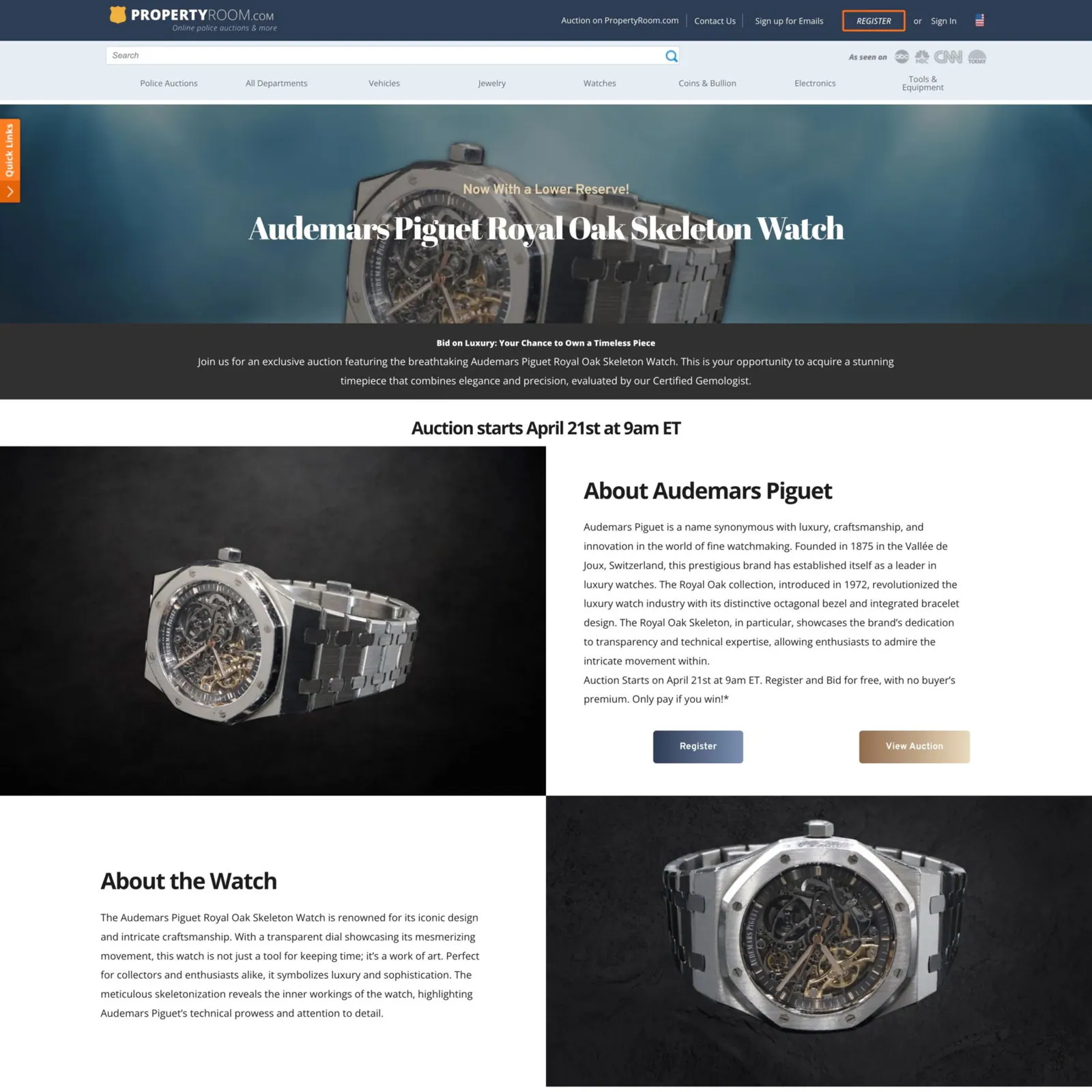
The Royal Oak Skeleton is one of those timepieces that instantly captures attention. Its open-worked design reveals the intricate mechanics beneath, showcasing the precision and craftsmanship that Audemars Piguet is celebrated for. The double balance wheel adds both technical sophistication and visual drama, resulting in a design that's equal parts performance and artistry.
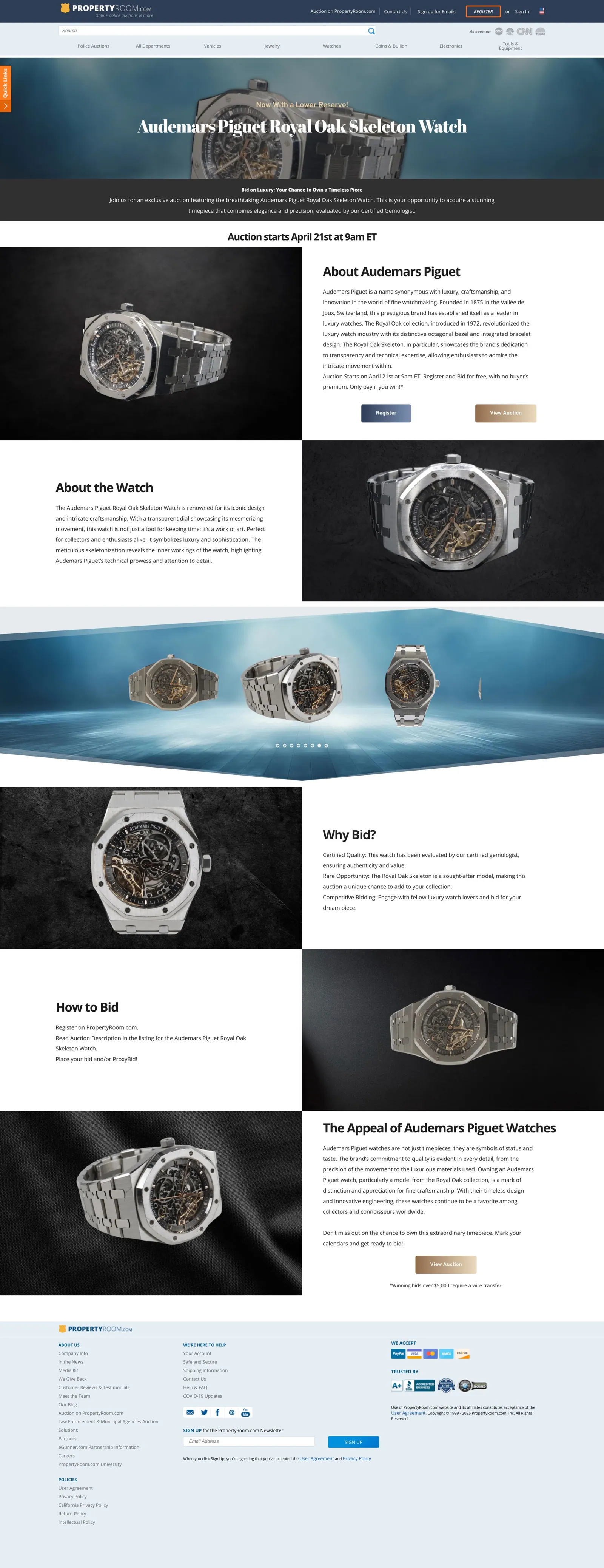
For this auction campaign, I designed a dedicated landing page, supported by homepage banners, social ads, and promotional emails for both the preview and live phases. The goal was to present the watch as not just a luxury item, but as a modern icon of design and innovation — blending elegance, exclusivity, and mechanical brilliance.
01 — Project Context & Goals
Presenting a modern horological icon
The aim of this campaign was to give an openworked luxury timepiece a presentation that matched its reputation. Collectors needed to understand what made this Royal Oak Skeleton special, trust the listing, and find the path to bid without friction. The visual treatment had to feel premium and editorial while remaining unmistakably part of the PropertyRoom marketplace.
02 — Design Strategy & Visual Hierarchy
High contrast, macro detail, one clear action
I built the look around high-contrast typography on deep, dark backgrounds so the brushed steel and gold-toned movement could glow. Macro photography framing pulls the eye into the openworked movement and double balance wheel — the detail that defines this watch — while wider shots establish the iconic octagonal bezel and integrated bracelet.
The hierarchy is deliberately simple: watch first, a concise headline second, and a bid-now call to action placed directly beneath the hero and repeated at natural decision points further down the page, so bidders never have to search for the next step.
 Hover to scroll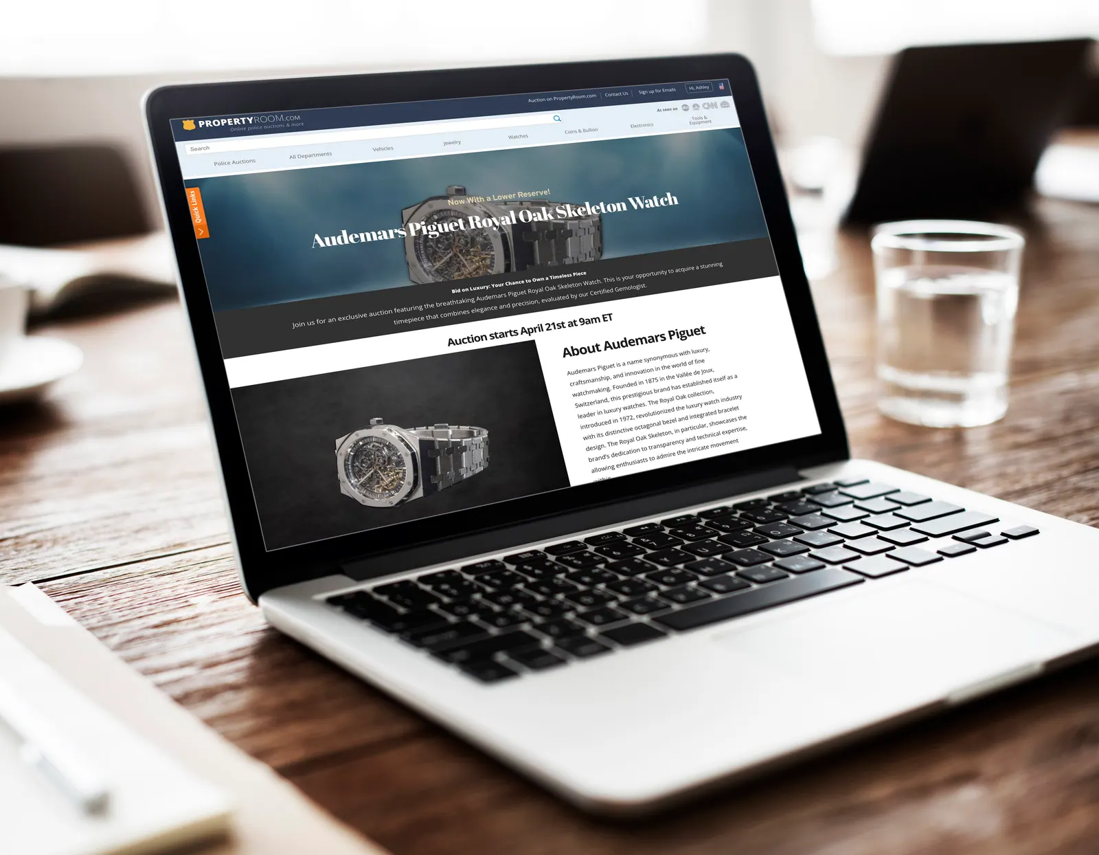




03 — Deliverables & Channels
One timepiece, every touchpoint
The campaign ran across preview and live phases, with each surface adapted from the same visual system.
- 01Landing page — hero, brand and watch background, auction details, and repeated bid-now placements.
- 02Email marketing layout — a single-column structure with macro imagery, a short story, and a prominent bid button that holds up on mobile clients.
- 03Homepage banners — compact placements that keep the watch and call to action legible at small sizes.
- 04Social ads — square and vertical variants built for quick, thumb-stopping recognition.
04 — Production Execution
Precision in the details
Designs were laid out in Figma and the photography was retouched and composited in Photoshop, with careful masking around the skeletonised movement so fine mechanical detail stayed crisp on dark grounds. Shared styles across email, web, and social kept typography, spacing, and button treatments consistent throughout the campaign.
Web & Campaign Design · PropertyRoom.com
Figma · Photoshop
© 2024